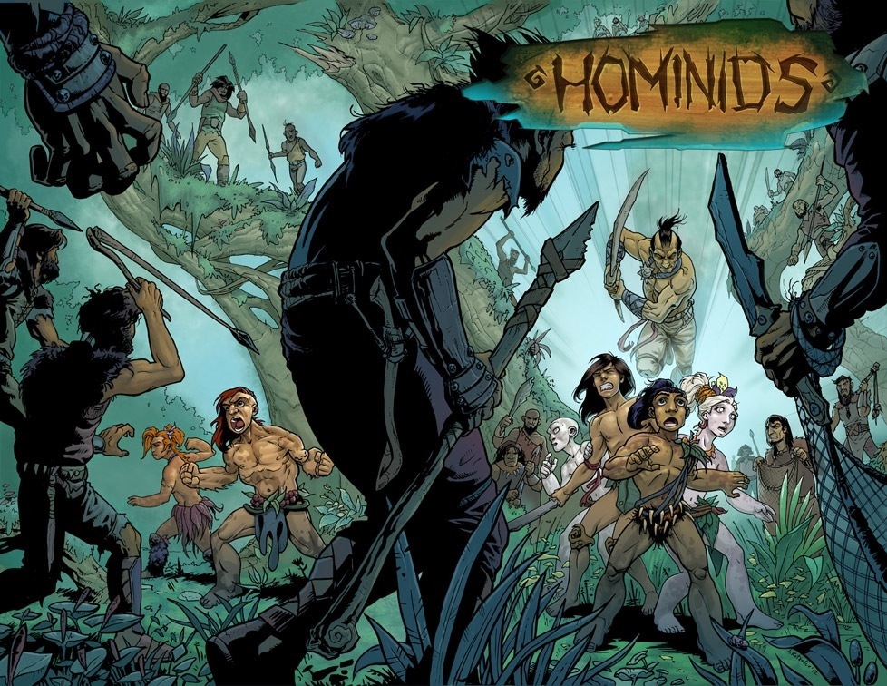
Chapter 4 has begun! It’ll all starts with this epic double-page cover. This is one of the funnest parts of making comics, is creating an illustration that encompasses the main event of each issue.
Comics in general have gotten away from this in the last ten years or so. Instead, you tend to see lots of action shots where the heroes are running towards some ambiguous threat or standing on a rooftop looking heroic. This may look great but it says nothing of the story inside! The other thing we often see is a beautifully created illustration that’s a bit abstract and also tells us nothing about the story, and they are usually created by a different artist then the one inside. This usually makes me put the comic right back on the self because I wanted to read a comic that looked like the cover I just picked up.
I like to harken back to the good ol’ days when a cover was not only drawn by the interior artist but also says a little something about what you will be reading. So I solemnly swear that the scene in this cover will show up in the story. Enjoy!


